How to Create Apple's Liquid Glass UI Style for the Web (Complete CSS Guide)
Modern web interfaces are evolving beyond flat design. One of the most exciting design trends is the Liquid Glass aesthetic inspired by Apple's latest interface

Abi Nandhan
Author
Published: July 16, 2026
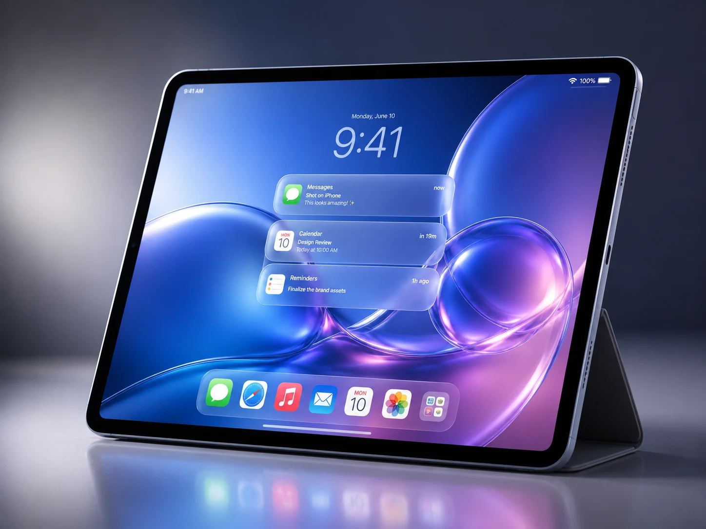
How to Create Apple's Liquid Glass UI Style for the Web (Complete CSS Guide)
Modern web interfaces are evolving beyond flat design. One of the most exciting design trends is the Liquid Glass aesthetic inspired by Apple's latest interface design language. It combines transparency, layered depth, soft reflections, frosted blur, and smooth animations to create interfaces that feel elegant and premium.
If you've recently seen Apple's software interfaces, you've likely noticed floating navigation bars, translucent panels, glossy notifications, and beautifully blurred backgrounds. The good news is that you can recreate a similar experience on the web using modern CSS.
In this guide, you'll learn how to build a Liquid Glass-inspired interface using HTML and CSS while keeping it performant and production-ready.
---
What is Liquid Glass UI?
Liquid Glass is a modern UI style that creates the illusion of physical translucent glass floating above the interface.
Instead of relying on flat colors, it combines:
- Frosted blur
- Semi-transparent surfaces
- Rounded corners
- Layered shadows
- Soft highlights
- Subtle reflections
- Dynamic gradients
- Smooth motion
The result is an interface that feels light, immersive, and visually refined.
---
Why Use This Design Style?
Liquid Glass works especially well because it enhances both aesthetics and usability.
Premium Appearance
Glass elements immediately make a website feel polished and modern.
Better Visual Hierarchy
Transparent layers separate sections without introducing heavy borders.
Flexible Design
The style works beautifully with both dark and light themes.
Modern User Experience
Ideal for SaaS products, AI tools, portfolios, dashboards, and landing pages.
---
Core Design Principles
A Liquid Glass interface is built around a few essential concepts.
1. Rounded Corners
border-radius:24px;
Rounded edges make every component feel soft and natural.
---
2. Semi-Transparent Background
background:rgba(255,255,255,.12);
Transparency allows the background to remain visible.
---
3. Backdrop Blur
backdrop-filter:blur(24px);
-webkit-backdrop-filter:blur(24px);
This creates the signature frosted glass effect.
---
4. Soft Borders
border:1px solid rgba(255,255,255,.18);
Thin borders define the glass without looking heavy.
---
5. Floating Shadows
box-shadow:
0 20px 40px rgba(0,0,0,.15);
Shadows create depth and make elements appear elevated.
---
6. Light Reflections
background:
linear-gradient(
135deg,
rgba(255,255,255,.25),
rgba(255,255,255,.08)
);
Reflections help simulate real glass.
---
Building a Glass Card
HTML
<div class="glass-card">
    <h2>Welcome</h2>
    <p>Create beautiful modern interfaces.</p>
</div>
CSS
.glass-card{
background:rgba(255,255,255,.12);
backdrop-filter:blur(24px);
-webkit-backdrop-filter:blur(24px);
border:1px solid rgba(255,255,255,.18);
border-radius:24px;
padding:40px;
box-shadow:0 20px 40px rgba(0,0,0,.15);
transition:.4s ease;
}
Hover
.glass-card:hover{
transform:translateY(-8px);
box-shadow:0 35px 70px rgba(0,0,0,.2);
}
---
Creating a Floating Navigation Bar
nav{
position:fixed;
top:20px;
left:50%;
transform:translateX(-50%);
padding:16px 28px;
border-radius:999px;
background:rgba(255,255,255,.08);
backdrop-filter:blur(30px);
border:1px solid rgba(255,255,255,.15);
}
---
Beautiful Glass Buttons
button{
padding:14px 28px;
border-radius:999px;
border:none;
background:rgba(255,255,255,.15);
backdrop-filter:blur(18px);
color:white;
cursor:pointer;
transition:.3s;
}
Hover
button:hover{
transform:scale(1.05);
background:rgba(255,255,255,.22);
}
---
Dynamic Background
Glass always looks better over vibrant backgrounds.
body{
background:
radial-gradient(circle at top left,#2ec5ff,#5b7fff),
radial-gradient(circle at bottom right,#ff7bc5,#8b5cf6);
}
---
Smooth Animations
transition:
transform .4s ease,
box-shadow .4s ease,
background .4s ease;
Floating animation
@keyframes float{
0%{transform:translateY(0);}
50%{transform:translateY(-8px);}
100%{transform:translateY(0);}
}
---
Best Color Palette
Light
- White
- Sky Blue
- Lavender
- Soft Gray
Dark
- Navy
- Black
- Indigo
- Purple
Neon
- Cyan
- Electric Blue
- Pink
- Violet
---
Browser Support
Modern browsers support the required CSS features.
- Chrome ✅
- Edge ✅
- Safari ✅
- Firefox (partial support)
Always include a fallback:
background:rgba(255,255,255,.85);
---
Performance Tips
Blur effects can become expensive when overused.
For the best performance:
- Limit backdrop-filter usage
- Compress background images
- Animate only transform and opacity
- Avoid dozens of glass panels on one page
- Use GPU-friendly transitions
If you're interested in more frontend performance optimization techniques, React development tips, and modern UI design tutorials, visit:
👉 https://abinandhan.in
---
Accessibility Tips
Remember that beautiful interfaces should remain accessible.
- Maintain strong text contrast
- Support keyboard navigation
- Provide visible focus states
- Respect reduced motion preferences
@media(prefers-reduced-motion:reduce){

*{
animation:none;
transition:none;
}

}
---
Common Mistakes
Avoid:
- Too much blur
- Very low text contrast
- Excessive transparency
- Large heavy shadows
- Overusing animations
Subtle effects usually look more premium.
---
Where Can You Use Liquid Glass?
This design style is perfect for:
- SaaS Websites
- AI Platforms
- Portfolio Websites
- Dashboards
- Mobile App Landing Pages
- Hero Sections
- Pricing Cards
- Settings Panels
- Login Pages
- Navigation Bars
Looking for more UI inspiration, React projects, Tailwind CSS tutorials, and frontend development articles?
Explore more at:
👉 https://abinandhan.in
---
More Frontend Development Guides
If you're passionate about building beautiful web experiences, you'll find more tutorials covering:
- React.js
- Tailwind CSS
- Modern CSS
- UI Design
- JavaScript
- Web Performance
- Animations
- Responsive Design
Visit:
🌐 https://abinandhan.in
---
Final Thoughts
Liquid Glass isn't simply about adding blur to a webpage. It's about creating depth, clarity, and elegant interactions that make interfaces feel alive.
By carefully combining transparency, gradients, lighting, shadows, and motion, you can build websites that feel modern without sacrificing usability.
Start with a navigation bar or card component, then gradually expand the design throughout your application.
---
Frequently Asked Questions
Is Liquid Glass the same as Glassmorphism?
No. Glassmorphism mainly focuses on blur and transparency, while Liquid Glass also introduces layered depth, reflections, smoother motion, and more realistic lighting.
---
Can I build it using only CSS?
Yes. Modern CSS provides almost everything required through backdrop-filter, gradients, shadows, transforms, and transitions.
---
Does it affect performance?
Blur effects require GPU rendering, so using too many blurred layers can impact performance. Keep effects subtle and optimize animations.
---
Which websites benefit most?
Liquid Glass works exceptionally well for:
- AI Products
- SaaS Applications
- Portfolios
- Dashboards
- Startup Landing Pages
- Creative Websites
---
Conclusion
Liquid Glass has quickly become one of the most elegant UI styles in modern web design. When implemented thoughtfully, it creates interfaces that feel immersive, lightweight, and premium.
Rather than copying a specific platform, focus on the underlying principles—transparency, depth, lighting, and smooth interaction—to craft experiences that are uniquely your own.
For more practical web development tutorials, UI inspiration, React projects, and modern frontend techniques, visit:
👉 https://abinandhan.in